
WHAT IS A GAMUT OR COLOR SPACE AND WHY DO I NEED TO KNOW ABOUT IT?
- getintocinema

- Aug 8, 2019
- 8 min read
Updated: Jan 19, 2020
First of all the dictionary definition of Gamut is “The complete range or scope of something”.
In video terms what it means is normally the full range of colours and brightness that can be either captured or displayed.
I’m sure you have probably heard of the specification REC-709 before. Well REC-709, short for ITU-R Recommendation, Broadcast Television, number 709. This recommendation sets out the display of colours and brightness that a television set or monitor should be able to display. Note that it is a recommendation for display devices, not for cameras, it is a “display reference” and you might hear me talking about when things are “display referenced” ie meeting these display standards or “scene referenced” which would me shooting the light and colours in a scene as they really are, rather than what they will look like on a display.
Color Diagram
To understand what we are talking about, we need some visual representation. Especially for colors. This diagram is the whole scale of colors human eye can see.

Here is the 1976’s CIE color diagram (u’v’) which is more accurate than the 1931’s (xy) in terms of representation of visible shade : 2 shades are significantly different and will always have the same gap on the CIE color diagram of 1976.
Pointer’s Gamut
Fully aware of the difficulty of replicating the whole diagram, Pointer started in 1980 by reducing what can really be glimpsed on Earth.

This part of the color diagram is called Gamut.
RGB Gamuts
As the screen’s tiles, the camera’s sensors work with 3 primary colors : red, green and blue.

The white triangle is the maximal Gamut RGB. It won’t cover Pointer’s Gamut, nor the whole color diagram.
Unfortunately, technically we couldn’t record and replicate the colors of maximal Gamut RGB. This made its use unadapted. To be able to concretely work, some Gamut were standardized.


Notes : The primaries, red, green and blue are not the same is these 3 Gamuts. Be careful because one video file won’t be displaying the same colors depending of the Gamut it is opened/read with. This is a FUNDAMENTAL question.
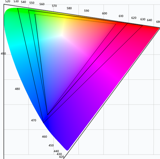
Anyway…. Perhaps you have seen a chart or diagram that looks like the one below before.

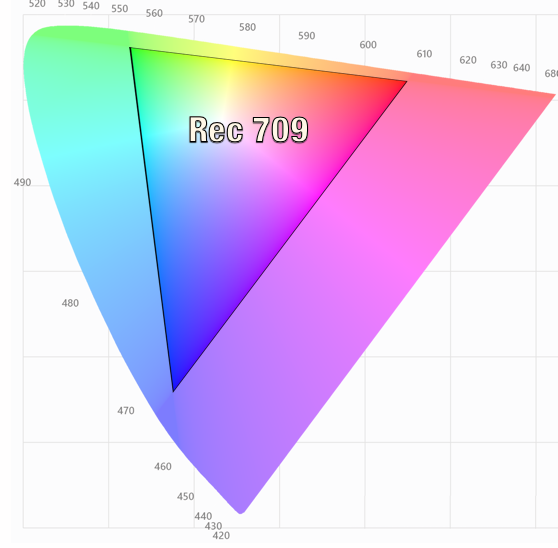
Now this shows several things. The big outer oval shape is what is considered to be the equivalent to what we can see with our own eyes. Within that range are triangles that represent the boundaries of different colour gamuts or colour ranges. The grey coloured triangle for example is REC-709.
Something useful to know is that the 3 corners of each of the triangles are whats referred to as the “primaries”. You will hear this term a lot when people talk about colour spaces because if you know where the primaries (corners) are, by joining them together you can find the size of the colour space or Gamut and what the colour response will be.
Look closely at the chart. Look at the shades of red, green or blue shown at the primaries for the REC-709 triangle. Now compare these with the shades shown at the primaries for the much larger F65 and F55 primaries. Is there much difference? Well no, not really. Can you figure out why there is so little difference?
Think about it for a moment, what type of display device are you looking at this chart on? It’s most likely a computer display of some kind and the Gamut of most computer displays is the same size as that of REC-709. So given that the display device your looking at the chart on can’t actually show any of the extended colours outside of the grey triangle anyway, is it really any surprise that you can’t see much of a difference between the 709 primaries and the F65 and F55 primaries.
That’s the problems with charts like this, they don’t really tell you everything that’s going on. It does however tell us some things. Lets have a look at another chart:

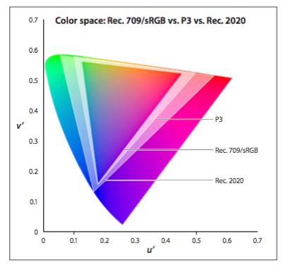
This chart is similar to the first one we looked at, but without the pretty colours. Blue is bottom left, Red is to the right and green top left.
What we are interested in here is the relationship between the different colour space triangles. Using the REC-709 triangle as our reference (as that’s the type of display most TV and video productions will be shown on) look at how S-Gamut and S-Gamut3 is much larger than 709. So S-Gamut will be able to record deeper, richer colours than 709 can ever hope to show. In addition, also note how S-Gamut isn’t just a bigger triangle, but it’s also twisted and distorted relative to 709. This is really important.
You may also want to refer to the top diagram as well as I do my best to explain this. The center of the overall gamut is white. As you draw a line out from the center towards the colour spaces primary the colour becomes more saturated (vivid). The position of the primary determines the exact hue or tone represented. Lets just consider green for the moment and lets pretend we are shooting a shot with 3 green apples. These apples have different amounts of green. The most vivid of the 3 apples has 8/10ths of what we can possibly see, the middle one 6/10ths and the least colourful one 4/10ths. The image below represents what the apples would look like to us if we saw them with our eyes.

If we were shooting with a camera designed to match the 709 display specification, which is often a good idea as we want the colours to look right on the TV, the the greenest, deepest green we can capture is the 709 green primary. lets consider the 709 green primary to be 6/10ths with 10/10ths being the greenest thing a human being can see. 6/10ths green will be recorded at our peak green recording level so that when we play back on a 709 TV it will display the greenest the most intense green that the display panel is capable of. So if we shoot the apples with a 709 compatible camera, 6/10ths green will be recorded at 100% as this is the richest green we can record (these are not real levels, I’m just using them to illustrate the principles involved) and this below is what the apples would look like on the TV screen.

So that’s rec-709, our 6/10ths green apple recorded at 100%. Everything above 6/10 will also be 100% so the 8/10th and 6/10ths green apples will look more or less the same.
What happens then if we record with a bigger Gamut. Lets say that the green primary for S-Gamut is 8/10ths of visible green. Now when recording this more vibrant 8/10ths green in S-Gamut it will be recorded at 100% because this is the most vibrant green that S-Gamut can record and everything less than 8/10 will be recorded at a lower percentage.
But what happens if we play back S-Gamut on a 709 display? Well when the 709 display sees that 100% signal it will show 6/10ths green, a paler less vibrant shade of green than the 8/10ths shade the camera captured because 6/10ths is the most vibrant green the display is capable of. All of our colours will be paler and less rich than they should be.

So that’s the first issue when shooting with a larger colour Gamut than the Gamut of the display device, the saturation will be incorrect, a dark green apple will be pale green. OK, that doesn’t sound like too big a problem, why don’t we just boost the saturation of the image in post production?
Well if the display is already showing our 100% green S-Gamut signal at the maximum it can show (6/10ths for Rec-709) then boosting the saturation won’t help colours that are already at the limit of what the display can show simply because it isn’t capable of showing them any greener than they already look. Boosting the saturation will make those colours not at the limit of the display technology richer, but those already at the limit won’t get any more colourful. So as we boost the saturation any pale green apples become greener while the deep green apples stay the same so we loose colour contrast between the pale and deep green apples. The end result is an image that doesn’t really look any different that it would have done if shot in Rec-709.

But, it’s even worse that just a difference to the saturation. Look at the triangles again and compare 709 with S-Gamut. Look at how much more green there is within the S-Gamut colour soace than the 709 colour space compared to red or blue. So what do you think will happen if we try to take that S-Gamut range and squeeze it in to the 709 range? Well there will be a distinct colour shift towards green as we have a greater percentage of green in S-Gamut than we should have in Rec-709 and that will generate a noticeable colour shift and the skewing of colours.


This is where Sony have been very clever with S-Gamut3. If you do take S-Gamut and squeeze it in to 709 then you will see a colour shift (as well as the saturation shift discussed earlier). But with S-Gamut3 Sony have altered the colour sampling within the colour space so that there is a better match between 709 and S-Gamut3. This means that when you squeeze S-Gamut3 into 709 there is virtually no colour shift. However S-Gamut3 is still a very big colour space so to correctly use it in a 709 environment you really need to use a Look Up Table (LUT) to re-map it into the smaller space without an appreciable saturation loss, mapping the colours in such a way that a dark green apple will still look darker green than a light green apple but keeping within the boundaries of what a 709 display can show.
Taking this one step further, realising that there are very few, if any display devices that can actually show a gamut as large as S-Gamut or S-Gamut3, Sony have developed a smaller Gamut known as S-Gamut3.cine that is a subset of S-Gamut3.
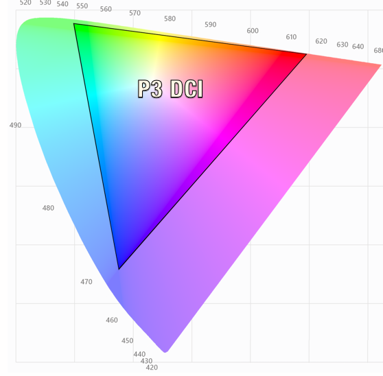
The benefit of this smaller gamut is that the red green and blue ratios are very close to 709. If you look at the triangles you can see that S-Gamut3.cine is more or less just a larger version of the 709 triangle. This means that colours shifts are almost totally eliminated making this gammut much easier to work with in post production. It’s still a large gamut, bigger than the DCI-P3 specification for digital cinema, so it still has a bigger colour range than we can ever normally hope to see, but as it is better aligned to both P3 and rec-709 colourists will find it much easier to work with. For productions that will end up as DCI-P3 a slight saturation boost is all that will be needed in many cases.
So as you can see, having a huge Gamut may not always be beneficial as often we don’t have any way to show it and simply adding more saturation to a seemingly de-saturated big gamut image may actually reduce the colour contrast as our already fully saturated objects, limited by what a 709 display can show, can’t get any more saturated. In addition a gamut such as S-Gamut that has a very different ratio of R, G and B to that of 709 will introduce colour shifts if it isn’t correctly re-mapped. This is why Sony developed S-Gamut3.cine, a big but not excessively large colour space that lines up well with both DCI-P3 and Rec-709 and is thus easier to handle in post production.
The White Point
There is a fourth significant item on the color diagram: the white dot. Either the color white or any neutral object (in real life). The range of possibilities defines a curve based on the temperature of the surrounding lighting.

D65 is the White Dop is usualy used, it corresponds to a 6504K° temperature
SOURCE: https://editfast.fr/en/classes/digital-video/color-standards/


Comments