How to Use and Read the Four Primary Video Scopes
- getintocinema

- Aug 4, 2019
- 7 min read
When you’re color correcting and grading, it’s important to accurately assess your video signal. You need to know if you’re crushing the blacks in that night shot, clipping the whites in those clouds, and what exact hue and saturation that logo is. Your monitor may not be properly calibrated, so that can’t be trusted, and our eyes adapt to the image, so we can’t trust them either.
But we can trust the scopes. The scopes never lie. They can be quite intimidating, though, if you’ve never learned how to interpret them. If you get high blood pressure and a rash from opening the scopes panel in your editing software, this article will cure your scope-o-fobia.
We’ll cover the most used scopes—Waveform scopes (RGB, Luma, YC and RGB Parade), the Vector Scopes, and the Histogram—and look at practical uses of all of them.
Waveform Scopes
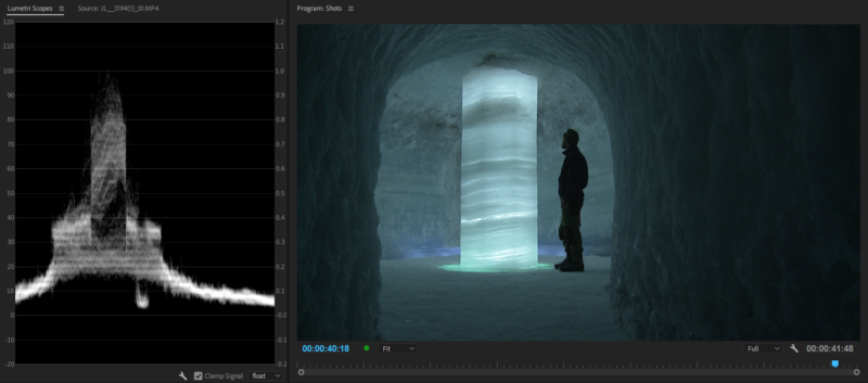
Using the waveform scope, you can see how light or dark the image is across your image. As the name suggests, it shows the picture’s brightness represented as a waveform. If you’re editing HD, Black is 0 and white is 100. Levels below 0 at the bottom of the scope will be clipped, and levels above 100 near the top of the scope will also be clipped, so you want your levels to be within the 0-100 range. This is true only for SDR (Standard Dynamic Range) video, though. With Ultra-HD standards comes High Dynamic Range delivery, where the whites can go all the way to 10,000.
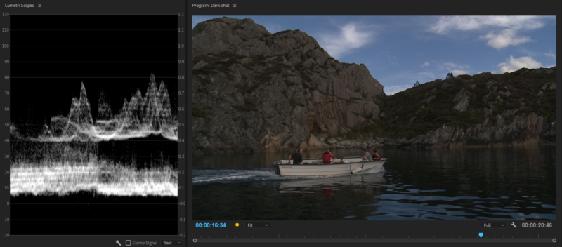
Here’s an under-exposed shot with its waveform. The maximum level–the brightest area–peaks at around 80 on the scope. The brightest part of this shot is the clouds, so this means the clouds will not be fully white. The darkest part rests around 5 on the scope, which means no part of it is fully black either. This is really good info when we want to correct the exposure.

By raising the white levels, slightly lowering the blacks, and making the midtones a lot brighter, we can utilize the full dynamic range of the image. Figure 2 shows how the brightest parts, the clouds, go all the way up to 100 after correcting the shot–but not above. This means we’re not clipping the whites, but the clouds will be fully white. Also, the blacks are a bit lower, with very small peaks almost touching the 0 line.
But the biggest difference before and after correction is that the mid-tones and shadows are spread over a larger range, making them more contrasty, and details we couldn’t see before have now emerged. Not every image ought to stretch perfectly from 0 to 100, of course. This is art, after all. But that is often a great first step in the color grading process.

Left is left, and right is right
OK, so bright parts show up in the upper area of the waveform, and shadows on the bottom. But what is the waveform showing on the left and right sides and in the middle? The left part of the scope shows pixels in the left part of the image, and levels on the right show pixels in the right part of the image.
The waveform takes each 1-pixel vertical slice of the image and maps it out on a scale of dark to light (low to high). That’s why there is no trace near the whites in the left part of the waveform above. The left 1/5th of the image has almost no sky in it, and so it has no values in the 90-100 range on the scope. But the right 4/5ths of the image have white clouds, and you can see the values approaching 100 on the scope.
Here are some images that show how the distribution of light and dark pixels from left to right is mirrored in the waveform scope.


The Top is not the Top
OK, so we’ve clearly seen that the left side of the image shows up in the left side of the Waveform Scope. But the top part of the scope does not show the top part of the image. It shows the brightest pixels. So, the spikes in the waveform below are very bright clouds. I’ve circled the corresponding areas in the scope and the shot, to make them easier for you to spot.


It takes a bit of training to read the scopes without thinking, but when you drag sliders, move curves, and adjust color wheels, you’ll see the waveform update. This way, you’ll immediately see what pixels you’re watching in the scopes.
If you’re color grading for broadcast, make sure your levels are in the 0-100 range. Levels below 0 and above 100 may cause your show to be rejected by quality control at many broadcasters.
So far, we’ve used the waveform scope with the color signal (chroma) switched off. With the color signal overlay, it can be hard to see the actual levels.

You’ll probably use the chroma overlay very seldom, because you’ll use the Vector Scope to assess your color levels.
The Waveform RGB Scope
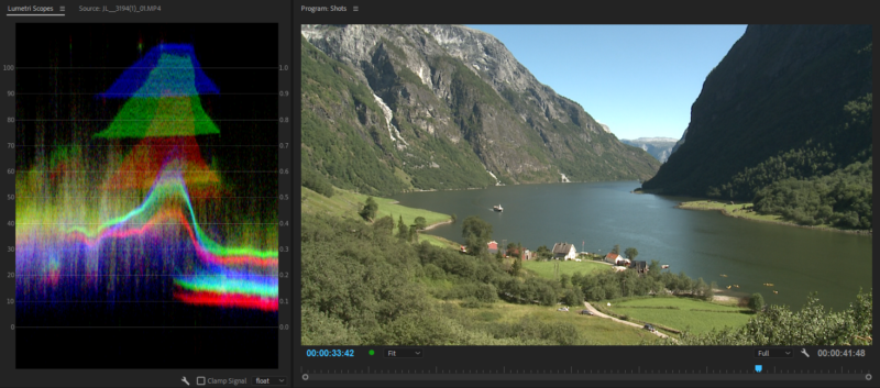
When we only show the luminance values in the Waveform Scope, it doesn’t tell us anything about the colors. The Waveform RGB Scope shows all the three colors that make up a video image – all at the same time. Take a look at the three images below, and you’ll see what I mean.


The RGB Waveform is very helpful when you’re trying to make a part of your image neutral. In the two images below, you will see that the lighthouse was a bit warm, with bands of red, green and blue in the RGB Waveform Scope. It was super easy to make the walls neutral, by adjusting the Temperature and Tint with color correction tools until the three bands overlapped, and showed as white in the scope.


The RGB Parade
Sometimes, it’s confusing to see all the three colors in one scope. That’s why we also have the RGB Parade, which shows the waveform for the three colors side by side, instead of on top of each other.


The RGB Parade is easily my favorite scope. It’s the most important scope in my workflow. I really like the fact that it corresponds so well with the RGB Curves, which are my favorite color correction tools.
In the image of the lighthouse, I could clearly see from the RGB Parade that I needed to lower the reds a lot, lower the greens a bit, and raise the blues. So I did this, watching my RGB Parade as I dragged the upper point of each curve. The correction can be done very quickly this way, because adjusting the blue curve only affects the blue waveform, the red curve only affects the red waveform, etc.

Working this way is so intuitive! You think “less red in the highs”, so you drag the top of the red curve down. You think “more blue in the shadows”, and drag the bottom of the blue curve up. It doesn’t get much easier than this.
When color grading, you’ll use your Waveform scopes as guides to place your shadows and highlights at “correct” levels, but the midtones you’ll mostly have to gauge by eye.
Scopes never lie…or do they?
To save on computer resources, some NLEs let you clamp the signal that goes to the scopes. This doesn’t affect your output at all, it only limits what you see in the scopes.

Clamping the scope signal means you will not see the overbrights and the super-blacks in the scopes. The two images below show the difference.


I recommend that you never clamp the signal in the Luma Waveform Scope. If your NLE also has an option to render the scopes in 8-bit or float (meaning 32-bit), choose float if your system can handle it. This will show the most accurate representation of your image.
The Histogram
If you’ve ever poked around in the settings on your camera, or if you’ve used Photoshop, you have probably seen a Histogram. It shows the distribution of dark and bright pixels in the image, but doesn’t tell you anything about where those pixels are. This makes it a bit less useful than the Waveform Scopes when color correcting video.
The left side of the Histogram shows the dark pixels, and the right side shows the brightest pixels. The height of the curve tells us how many pixels we have with a given brightness.

Like the Waveform Scopes, the Histogram can show luminance only, or separate Histograms for red, green and blue. The Histograms in some NLEs are turned sideways to the ones in Photoshop, but they still work the same way. If you’re comparing different scopes, turning it “sideways” can be useful, because we now have dark at the bottom and light at the top, just like in the waveform.

Notice in the image above that the Histogram in Premiere shows the minimum black and maximum white levels as numbers for each color. This lets you find peaks that may escape your eyes in the Waveform Scopes because the peaks are too small to see.
Vector Scopes
The YC Vector Scope is the scope you will use to measure the hue and saturation of your colors. The distance from the center tells you how saturated the colors are. A small dot in the center means it’s a black and white shot. A trace close to the surrounding circle means your colors are super-saturated.
You will want to use the vector scope when adjusting skin tone and other memory colors, and to check the saturation of a color.

The angle of the trace in the Vector Scope tells you what hue the pixels in your image are. The brighter the scope is in a particular angle, the more pixels in the image have that color.

The colors in a colorbar should show in the boxes with their names—or more likely, their letters. B for Blue, R for Red, Yl for Yellow, Cy for Cyan, etc.

Skin colors should point in the direction of the Skin Tone line. This is the upper left of the crossed lines in the Vector Scope.


Comments